
In today’s hyper-competitive market, branding goes beyond logos and taglines; it’s about crafting meaningful connections with consumers. One of the most important tools in a brand’s arsenal is color. Colors have the remarkable ability to convey emotions, shape perceptions, and influence purchasing decisions. This is where color psychology comes in—it’s all about how different colors affect our thoughts and feelings. Understanding color psychology in branding is crucial to establish emotional connections with consumers, and effective color management ensures that these emotional associations remain consistent across various mediums and devices. But first, let’s explore what color psychology entails and its real impact on brands.

Understanding the depths of color psychology
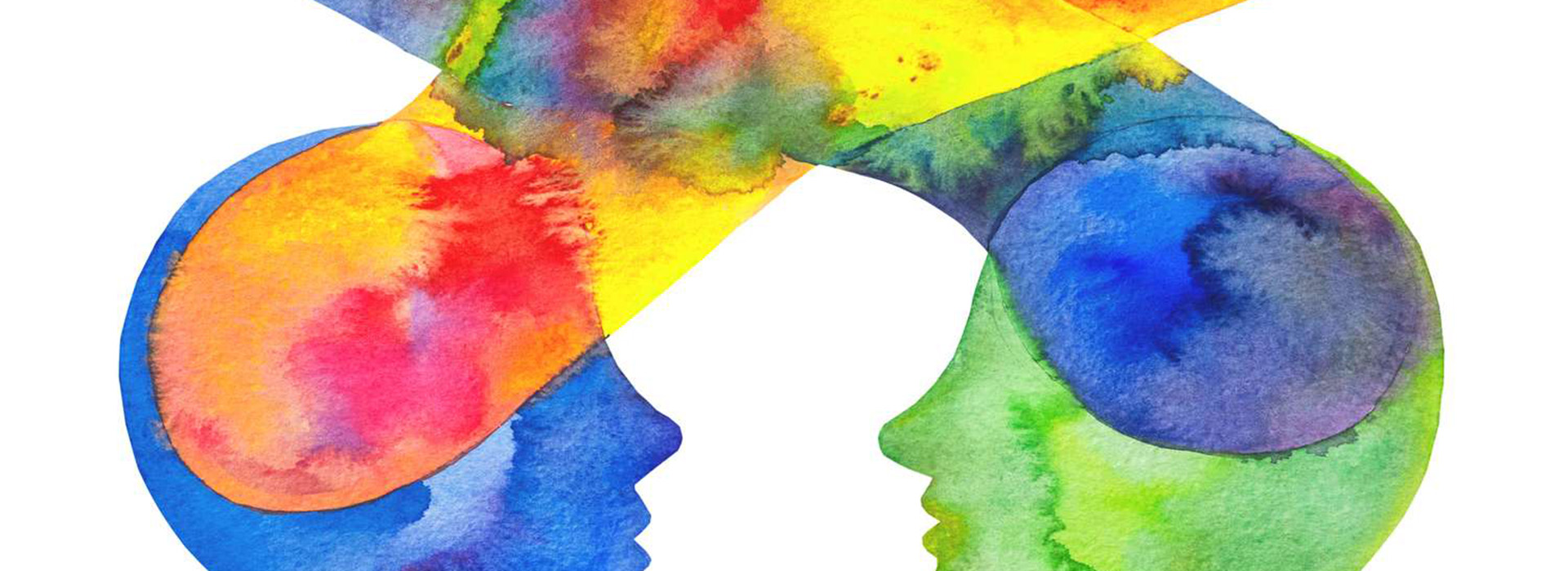
Colors have a big impact on our emotions and actions. Businesses use this by picking colors carefully to influence what we buy and how we see their brand. You might have seen pictures like this in articles about color psychology:

But the truth is that such broad statements are often inaccurate for a variety of reasons. These assumptions can vary based on cultural, societal, and personal factors. For example, one important factor is personal association with a color. If a person’s favorite stuffed animal as a child was blue, they may have a lifelong preference for blue. On the other hand, if they had a negative experience with a blue object, such as feeling uncomfortable in a room painted blue, they may have a strong negative emotional reaction to blue. So, if color psychology is an imprecise field, yet very important for marketing and branding, how can companies and businesses make sound decisions about their colors?
Selecting brand colors: context matters!
The key word here is context. These associations should not be completely ignored, but rather analyzed in the context of your brand. Businesses must ensure that the colors chosen are appropriate for the product or service being marketed. For example, consider a coffee shop that uses green in its branding. Green is often associated with nature, tranquility, and health, which fits perfectly with the coffee shop’s goal of providing a relaxing environment and promoting its use of organic, sustainable products. In contrast, if a cutting-edge tech startup were to prominently use the same shade of green, it might struggle to convey the high-tech, innovative image it seeks. Instead, the tech company might opt for sleek, modern colors like silver or dark blue to emphasize its focus on innovation and reliability.
Other studies have also shown the importance of differentiating yourself from the competition by using colors that make your brand easily recognizable. For example, if a major player in your market uses blue as its brand color, you don’t want to use the same color for your brand, or even similar colors. Choosing the right color can help your brand stand out by taking into account the psychological principle known as the isolation effect, which states that an item that stands out is more likely to be remembered, and that people recognize an item or product much better when it sticks out from its surroundings.
So the right color should not only trigger the emotions with your audience, but also set your brand apart. Understanding the context of your brand, along with the usual emotional associations, mixed with critical thinking and a little research, should do the trick when choosing your brand colors. And while this blog post may have raised more questions than answers, color psychology is anything but rocket science, and remember that just because a topic is full of maybes and sort ofs doesn’t mean we can’t think critically about it.
Strenghtening brand identity
In a world of uncertainty, one thing remains clear, and several studies prove it: buying decisions are emotional decisions, and what we buy – and who we buy it from – often depends on how emotionally we perceive a brand. When a brand’s colors are carefully selected and consistently applied across all brand elements, it strengthens the brand’s identity and helps to ensure that a company’s message remains clear, trusted and recognized. Color management is crucial in this process. It involves the precise control and coordination of colors across various platforms and mediums to maintain consistency and accuracy. This ensures that the intended emotional impact of colors remains intact, regardless of where they are viewed. Thus, color psychology and color management work hand in hand to create cohesive and impactful visual identities.
As you navigate the colorful world of branding, let us be your guide. Our color management solutions ensure that your brand’s emotional impact remains consistent and powerful across all platforms. Don’t leave your brand’s identity to chance – partner with us and make every hue count.