
Rendering Intent Explained
“Color space” refers to the range of all colors that a device can output or capture. Color spaces can vary significantly in size, depending on the technical capabilities of the device. No device can reproduce or display the entire color space visible to the human eye. As an example, highly saturated spot colors, often cannot be achieved in process-color printing.
Reference color spaces are device- and media-independent color spaces that are based on human color perception. They can be used to match the color registration and color reproduction of peripheral devices.
In general, RGB color spaces, e.g., of digital cameras, are in many cases larger than the CMYK color spaces of printers.
So, if you want to reproduce an image that is displayed on the screen in a relatively large color space in CMYK printing with its relatively small color space, you need a strategy for dealing with the colors that cannot be printed. With rendering intents, you can determine the appropriate conversion and thus positively iinfluence the output.
Gamut Mapping: Converting Color Spaces
When printing digital images, partial data loss within the color space is imminent during the rendering transition. This is because an image may comprise a large RGB color space, and printing, limited to a smaller CMYK color gamut. The gamut (another term for color space) should therefore be converted depending on the input device used (source medium), and the output device (target medium). The visible disparity in color caused by the transition should be confined to a minimum. In programs such as Adobe Creative Suite or QuarkXPress, the dynamic range of source colors not able to be reproduced with an output device, are therefore rendered from the input to the output gamut. This conversion is called Gamut Mapping.
Rendering Intents: The Conversion Methods
There are no restrictive conversion methods for converting an image captured in RGB to CMYK. Depending on the image attributes, and the output device, there are various methods you can use to achieve the best possible results. To ascertain an optimized transition from reference to target device, the ICC (International Color Consortium) developed rendering intents. These determine the color conversion from one color space to another. Users can find them in a myriad of color management systems, predominantly integrated in graphic and design software. Whether you want to display a soft proof in Photoshop or perform a color calibration on the monitor: You are always asked for the “rendering priority”.
The Four Rendering Intents
The ICC defined four rendering intents, which do not comply to any standard, but solely specify a condition for a conversion. For this reason, the result – similar to an analog film, which has assorted colors depending on the manufacturer and development – can vary depending on the color conversion used. If for instance Adobe’s color management is utilized in a Windows system, the final colors may deviate from the colors generated in a MacOS-specific color management, for example.Page Break
There are four rendering intents defined by the ICC:
- Perceptual
- Relative colorimetric
- Absolute colorimetric
- Saturation.
The rendering intents are divided into two categories:
- For other print outputs (re-targeting), this category includes the absolute colorimetric and the relative colorimetric rendering intent
- For a new purpose (re-purposing), these include perceptual and saturation preserving rendering intent
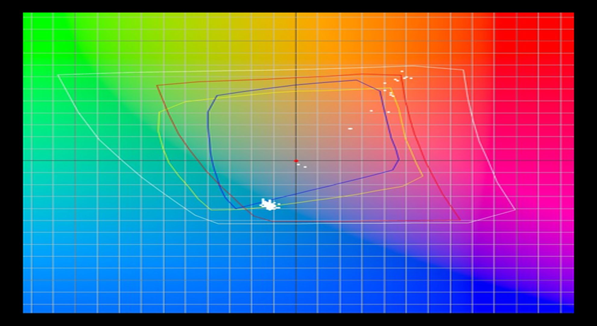
- The Relative Colorimetric Rendering Intent
The colorimetric rendering intents map colors as precisely as possible from the source to the target color space. All out of gamut input colors that cannot be reproduced on the output target device, are relocated to their nearest in gamut color at the outer perimeter of the output color space. This procedure leads to high accuracy results in color corresponding areas of the two systems, but occasionally can lead to banding and issues in the border area, e.g. with gradients. This rendering intent is used when converting from CMYK 1 to CMYK 2, from a smaller source color space to a larger target color space, or for digital proofing on normal printing paper. The output color space must be at least the same size as the reference color space so that the colors are converted accurately. If you intend to render a soft proof on the monitor, select the relatively colorimetric rendering intent. This conversion method first analyzes the white point of the source and the target, and then converts the colors based on this. Again, the colors are clipped at the edge of the output color space, which can cause very bright hues to fray. The colors, however, are rendered brilliantly and brightly, so you should use relatively colorimetric, which may engender a similar outcome to the saturation-preserved method. This could be an option for presentations and vector graphic applications.
Rendering Intent Relative Colorimetric with sample and reference profile
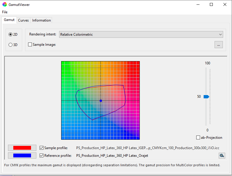
2. The Absolute Colorimetric Rendering Intent
Works equivalently to the relative colorimetric rendering intent but can additionally simulate the white point (paper white). Used for digital proofs on special production paper (not the usual copy paper) or for displaying the print preview on screens. If an image is printed on a digital printer with more than the usual four colors, select absolute colorimetric. This method considers both the paper white and the absolute color values, which ensures that the digital proof is aligned to the final printed result in most conventional printing techniques. Quality loss is nominal, consequently making it a favored option and default in most image-editing programs.

Rendering Intent Absolute Colorimetric with sample and reference profile
- The Perceptual Rendering Intent
This rendering intent “compresses” all colors of the source color space into the usually smaller output color space. Colors that can be represented in both color spaces are also shifted in the process. The image representation is maintained thanks to an even compression of all color values of the larger source color space into the smaller destination color space. In other words, there are slight color changes across the entire color space, but there is no simple “clipping” at the edge of the color space; instead, even color spacing is maintained. A gradient still appears uniform, even if it no longer matches the original 100% in colorimetric terms. The conversion is non-linear, and saturated colors are compressed more than unsaturated. The reason for this is that color changes in less saturated colors are perceived more intensively by the human eye, than deviations in saturated colors. This also acknowledges the smaller range of colors in print, which may evolve into a pale-looking depiction. Despite this, “perceptual” is a legitimate choice for converting RGB to CMYK. When converting an image for printing on paper, the conversion is often perceptual. In Photoshop, in section “Conversion Options” of the Color Settings (menu “Edit”), you will find “Priority”, which you should set to “Perceptual”.
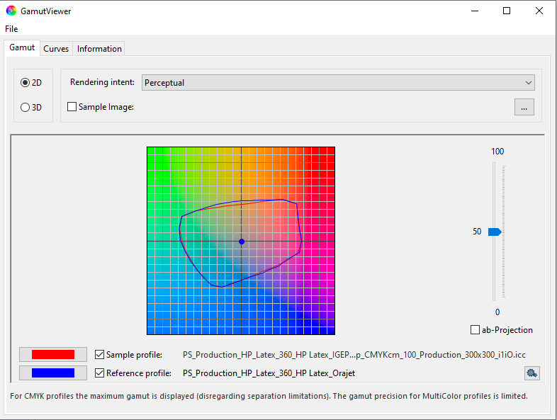
Rendering Intent Perceptual with sample and reference profile
4. The Rendering Intent “Saturation”
In the graphics industry, this rendering intent is commonly not a preference, as it favors a vivid reproduction of graphics at the expense of color accuracy. However, “saturation” is the only rendering intent that uses the full output color space.
It is however, well suited for printing, and subsequently predestined for transitions from RGB to CMYK, when “vivid” colors are preferred over color precision. Especially invigorating or bright colors are reproduced particularly well in print, because it converts the colors in the range of saturation in the best viable way. However, other attributes such as brightness etc., are altered in the process, often at the expense of the color tones. Presentations in which the color tone is not critical, would be suitable for this conversion method. These include presentations or diagrams, but also vector graphics, which color values do not necessarily have to strictly correspond with the original.

Rendering Intent Saturation with sample and reference profile